
Summary: Using the principles of information architecture, Grant Carmichael discovers four design principles that go into making a good conference name badge.

If you’ve ever been to a conference, then you’ve probably had a badge deck around your neck. It’s a paper concierge that broadcasts who you are, helps you navigate space and orients you to the day’s events. It may not need power or wifi, but what it does need is a foundation of information architecture.
The typical conference journey has many adventurers: Attendees, Speakers, Sponsors, Volunteers, Hosts, Media, and Security. Visualizing how their needs play out before, during and after the event across contexts helps the decision-making for what to include across channels.

Over the course of three TEDxGrandRapids events and Midwest UX 2013, I collaborated with several other designers to explore the concept of what a conference badge deck should be and four design principles emerged.
Principle 1: Broadcast Clearly
Who are you? Breaking the ice or ensuring access, your name is a key to the event. Your name should be clearly visible from across a room and always be outwardly readable regardless of which way the badge is facing. Fix badge orientation with two anchor points or if on a single-point lanyard, print names on both sides because all too often, badges flip around but your name should not.
Other identifying information to prioritize may include your role at the conference, the organization you represent, social media contact and even custom conversation starters to allow a person to reveal their personality. During registration or initial contact, let people know that you’re not just collecting names, you are giving them a framework to control aspects of how and what they want to broadcast on their badge (ideally with a preview).
How this information is emphasized can also set a casual or formal tone of interaction. Consider the nature of the gathering, does it draw from a local community or bring prominent leaders from all around the world? Should first names be emphasized to foster conversation or last names to foster recognition? While we chose to emphasize first names at our regional event, Richard Saul Wurman, creator of the TED conference and speaker at TEDxGR 2014, preferred emphasis on the last name. Perhaps this nuance will inform further differentiation between Attendee and Speaker badges at future events.
Principle 2: Tune Content

TEDxGrandRapids Photographer: Rob Vander Sloot. https://flic.kr/p/bVJpML CC BY-NC-ND 2.0
What is a map? A map means different things to different people depending on whether they are planning to book a hotel; finding the best route from the airport once they arrive; finding parking options; finding a local specialty coffee shop within walking distance; seeking the next session or the nearest bathroom. By understanding the conference context, we can know what a map best means for a badge deck.
The website can go deep with wide-area maps, speaker biographies and expanded descriptions whereas brevity is the soul of the badge deck. Dedicate pages to a single topic wherever possible for at-a-glance consumption.
Schedule
Speakers
Map (event spaces and areas walkable in-between)
Conference tips (wifi, lunch menu, where to get help and event what to tweet if you get lost e.g. #WTFMWUX)
Personalized info (chosen workshops/excursions, drink tickets)
About/sustainability
Don’t forget your Sponsors!
Notes
Principle 3: Aim for Comfort
Lucas Caranch the Younger (public domain), via Wikimedia Commons
Build prototypes and find out what is comfortable to wear for men and women and observe how people manage reading and interacting with the badge. Discover what is too high or low to wear, what is too close to read or what typefaces and orientation is the easiest to read and flip through. Will snap-off badges or adjustable lanyards be necessary for people to comfortably read content?
Principle 4: Consider Materials
How will the wearer feel about the materials? Does a one-day event need plastic badges? Do weeklong events lose pages and get shoved into a pocket? Specify materials to allow the badge to last only as long as it needs to.
TEDxGrandRapids, Photographer: David Chandler. https://flic.kr/p/ehSuGv CC BY-NC-ND 2.0
Source recycled/recyclable materials, ones that compost, be re-used or repurposed. TEDxMacatawa used seeded paper because why toss it? Plant it!
Collect lanyards for re-use if event is reoccurring.
Choose papers that ink will dry easily on. People will want to write on the badges for notes, reminders and more.
Badge material noise is easily overlooked but metal swivels, heavy pouches and other combinations can create a distracting cacophony, especially in groups.
Ahead of planning for the inaugural TEDxGrandRapids in 2011, I was inspired particularly by Danielle Malik’s elegant Interaction’11 conference badge design.
Hung from two points of contact for consistent orientation
Simple hole-punched cards
Light-touch elastic lanyard for adjustable reading distance
Personalized content
First Iteration: TEDxGrandRapids 2011
Design: ThinkXD + Andy Van Solkema of Visualhero.

Hole punched cards
First Name emphasis, twitter, easy reading, personalized content
Easy readability for wearer, right-side up when naturally flipped up from torso.
One topic per card
When the badge is flipped open, the closest card was the most challenging for wearer to read so we opted to replace it with broadcast conversation starters
Second Iteration: TEDxGrandRapids 2012

For TEDxGR 2012, Laurel Stanley and I worked with Mike Gorman and Yolanda Gonzalez of Mr&Mrs.
A more durable booklet with metal loop stitching for easy lanyard connection
Name on both sides of badge cover
Tear-off perforated contact info on each page
Optional sketch booklet that mirrors the badge to add to the lanyard
Planned production delivery organized to expedite registration set-up
Third Iteration: TEDxGR 2013
We worked again with Mr&Mrs and Conduit Studio.
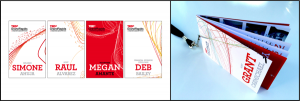
Random unique cover designs for each badge, color and label distinction for roles
Improved reading flow front to back
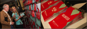
Fourth Iteration: Midwest UX 2013

Midwest UX https://flic.kr/p/gMK322
For Midwest UX, our team included MKN Design’s Michael Nÿkamp and Ryan VanDyke of Visualhero.
Unique designs for Attendees, Speakers and Hosts
Fifth Iteration: TEDxGrandRapids 2014
TEDxGrandRapids Photographer: Richard Deming https://flic.kr/p/nAbWoj https://flic.kr/p/nCcLcp CC BY-ND 2.0
For this event I got to experience the badge not from the design team but as an attendee.
Kelly O’Hara of Conduit Studio and Kate Hunt’s TEDxGR Design team really refined the content flow, visual design and how the badge was distributed during registration with an evolving wall that enabled everyone to easily find their badge and reveal a message as the badges circulated into the audience.
Information Architecture is at the Core
One-off badge design efforts can easily miss fundamental affordances that may seem obvious in the context of use. At our first event we tried not to reinvent the wheel but build upon understanding of needs, wear some prototypes and benchmark others. But it took a second event to really arrive at a solid framework.
Conferences are temporary events that have many moving parts and critical touchpoints for every person flowing through them. Information Architecture was at the core of the UX for these events, as we defined personas and uncovered needs over time and across channels. IA guided the structure of information and form of not only the badge but also the website, signage, internal/external communications and the spaces themselves, increasing the likelihood that our events will embody coherence and provide moments of delight.
The four principles were derived from what we learned along the way and will especially help new planning teams designing their first badge. I encourage designers to share their input on these principles and share new ones.