Learn From Us
Training and Education Powered by Information Architecture
We teach people how to approach complexity and design digital places that are resilient and intuitive.
We live in a modern world where digital transformation drives business transformation. With TUG, the world is a better place when we use our skills and expertise to bring clarity to people working with these complex systems. Driven by over ten years of success with companies, large and small, TUG has taken on the assignment of sharing our expertise through teaching others. We want to pass our understanding on to you.

Workshops
We've designed our workshops to teach the discipline and show the value of information architecture (IA) in practical ways. Our workshops and events help your team learn new skills to bring more clarity to the complexity of your work.
Select one of the workshops for more information.

Starts the week of August 4, 2025

Starts the week of August 18, 2025

Available to schedule for your team

Available to schedule for your team
You can register as an individual through our website. You can also contact us to discuss scheduling one or more cohorts for your company. As a bonus, all workshops are free for past participants who wish to retake them.
Events

TUG Webinars
Our webinars cover topics ranging from best practices in information architecture to the latest in artificial intelligence. Be sure to join us and our special guests.
World Information Architecture Day (WIAD)
Inspired by Andrew Hinton's seminal work, Understanding Context, the theme for 2024 invited us to explore the complex tapestry of context in our digital worlds. As hosts of the WIAD - Ann Arbor hybrid event, we have the recordings.

Architecture Walks
TUG co-founder Dan Klyn leads groups of all types on walks in the built environment, often as part of a design conference.
Writings + Conversations
Browse our articles and ideas about information architecture.
IA Practice


IA Theory


Sunday Conversations
Podcasts with the TUG team and friends.
RSW
Dan Klyn’s research on the life and work of Richard Saul Wurman.
Free Poster Downloads
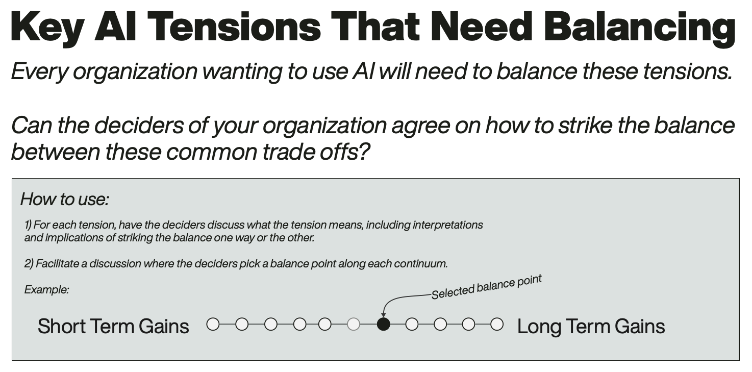
Download one of our free posters to jump-start your quest to make the complex clear. From an IA heuristics checklist, to a framework for organizing your IA strategy, to tools for ethical Artificial Intelligence Alignment, TUG has some of the most exciting free resources in all of Information Architecture space. Take a look and download one today!