Summary: Kaarin marvels at how the information architecture of an Italian department store’s website understands its customers’ desired shopping experience.
At The Understanding Group, we believe it is essential to first understand the business and its users before designing the information architecture of the digital world that the business and users will be living in. We also talk about about Ducks versus Decorated Sheds—in other words, the difference in affordance between a duck-shaped building custom-built for a business that sells things related to ducks, versus a generic box structure with an interchangeable sign.
Recently I saw an amazing example of a “Duck” website designed for a quintessential Italian department store and the Milanese user.
I had the pleasure of taking a two-hour walk in Milan, Italy. I had no objective beyond observing. What I saw was nature and experiences. Parks surprise you around a busy street corner. Fountains and trees mark the entrance to a bank. Alluring courtyards peek at you behind wrought-iron gates, and you imagine the residents there enjoying their morning smoke and studying the blossoms. Smoke breaks! Groups of happy Italians stand on sun-soaked steps outside of their office buildings. To an outsider, life in Italy seems amazingly filled with time outside— walking to work, smoking on the stoop, eating at cafés, and socializing at happy hours under umbrellas on side streets.
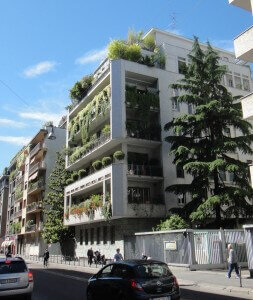
And there is more. Every apartment with a balcony has green, lush plants dripping off of it. There are flowers for sale on every street. Food in the groceries looks fresh and full of life and so do the people who eat it.
I confess, I’ve been acting like a northern hermit. Our long Michigan winters program us to be indoor-focused. Drive to work alone, eat inside the office, drive home alone, cook dinner with my husband, watch TV. So by contrast, the outdoor-loving, extroverted lifestyle here is enticing.
The other thing I noticed on this walk is the amount of people checking me out. Being out in public is to be part of the view; whether you assent or not, you are a product on display. Assessment of what others were wearing seemed part of everyday behavior.
Web Information Architecture Understands Italian Shoppers
So back to the point about needing to understand users to make a website for them: the website for la Rinascent—the famous and well-established upscale department store—is up-front and bold in declaring its connection with nature and with BRANDS. Apparently Italians love brands—I wouldn’t notice what brands people were wearing on my walk any more than I could recognize car models—but I’ve read this observation in many places.
On this website, the homepage starts with an incredible video where people are made of nature, clothes are made of nature, and everything is beautiful!
Then there is a chunk of news—making the statement that la Rinascent has activities that you can get involved with. Then a fantastically huge footer of navigation.
However, none of the links take you to shopping. You can’t look at Women’s accessories! You can only see brands. This company understands the customer; they want quality brands. Clicking on the brand tells you where you can go buy it.
Did you know food has brands? Of course, I just usually don’t think of it like that.
‘About Us’ is tucked under ‘Discover More,’ out of the way of your primary path.
A couple of days later I was able to visit la Rinascente in real life. The whole store was made up of what felt like mini boutiques. There was a Prada block and a Valentino block. And then I found the basement was perhaps a “clearance” area: there were rows of tables, and the entire ceiling was covered in signs that denoted what brands were represented. For example, there was a lighting section, but it wasn’t organized with table lamps and ceiling lamps and floor lamps—it was organized by brand. Nor was it labeled lighting. It was organized by brand and labeled accordingly. Truly a fun experience. I love how every business and every user base is so unique.
So thank you to whoever designed this site. Thank you for understanding la Rinascente as a business, and this wonderfully vibrant city as its users, and for providing such a fun underpinning to my observations from this walk.


