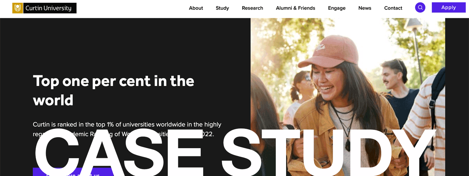
Curtin University, based in Australia, has an expanding global presence, including locations in Western Australia, Malaysia, Singapore, Dubai, and Mauritius. Over 3,000 staff serve more than 50,000 students with a range of industry-aligned undergraduate and postgraduate degree courses.
Curtin needed a clear information architecture strategy that meaningfully structured its ecosystem in a way that it could be easily governed and maintained while satisfying the University’s goals and those of the wide-ranging users in Australia and globally.
The Problem: Competing Voices and Lack of Structure
Curtin’s digital ecosystem faced challenges familiar to many enterprise-scale organizations. It serves a diverse user base, all with unique content needs and contexts. Many voices competed to inform the content and structure for hundreds of subdomains and thousands of pages, both private and public. There needed to be a coherent structure to aid findability for essential audiences. The site mainly relied on unchanging “popular” links to help guide people to the content they needed.
The Solution: A Meaningful and Efficient Digital Place
TUG delivered a meaningful digital place for prospective students and staff, international students, research and industry partners. The resulting structure provided customers with a consistent, predictable and satisfying experience, and clearly communicated the business objectives of the University. This was designed to help increase recruitment by providing a better experience for prospective students, and create a more efficient and easier to maintain website.
How We Succeeded: Our PASS Process
Our team flew to Perth, where we kicked off the PASS Process with interviews to gain business context and aspirations and identify areas of tension between the different stakeholders. We also worked to understand how content was organized across the ecosystem, how it performs, and what is measured. Outputs from the interviews were used to develop a set of strategic tension points that we asked the organization to balance as inputs to the new architecture.
We then conducted 29 user interviews across the different types of visitors Curtin served including future and current students, staff, researchers, alumni, partners and parents. This was combined with competitive benchmarking and audits of the existing taxonomy and governance models. We distilled those findings into emergent user themes that mapped to a model of different user journeys.
The clear organizational intent combined with a clear picture of user needs led to the design of a durable structure and governance plan to make a meaningful, consistent, and satisfying digital place that reduces friction. From our findings, we proposed three broad themes to guide content strategy efforts that better balanced how content should be expressed on the website and helped avoid dense, text-heavy pages that were an issue on the original site.
The TUG team then built a set of blueprints and specifications tailored to the requirements of the Curtin team that planned to construct the site. All of this was pulled into a Toolkit which the Curtain team could use to decide how to integrate content into the new structure.
Epilogue
Curtin launched its new site and received high marks from stakeholders and users. The feedback on the project from the Curtin team was universally positive. Stakeholders united behind the vision presented and were delighted with the quality of the deliverables. As Joanne N., lead business analyst noted, TUG delivered more than the typical plan and “[I am] much happier to see what TUG presented, based on evidence.” The overall program manager, Marty, noted consistent positive feedback from all participating stakeholders.


