Summary: What is the best onsite findability strategy for your website? It depends on your users, what they already know, and how complex your site is.
In the last 10 years, the rise of excellent search engines has changed the way that sites approach findability of their content. On many modern sites, less than 20% of sessions start on the home page, because users are pointed to some internal point in the site. This has in some ways obscured the critical role of websites to assist users in traveling the “last mile” from the site to their desired target. In short, many sites have abdicated their responsibility to be good guides.
The “guide” is the friendly voice helping people discover spaces where they can learn, work, and play. Guides provide multiple ways for users to find the things they need, be it navigation, filters, or internal query search. They each guide users, and each can be useful and valid. But many sites have all 3 strategies because that’s what “sites need,” or because UX best practices argue for serving different user patterns.
Guided Tours Unit, United Nations, New York. Photo: United Nations/John Gillespie
But not all sites need all guidance strategies. In fact, choosing to focus on fewer approaches can make your site better overall, because sometimes a certain kind of guidance can actually be unhelpful. For example, if:
The visitors don’t have a domain-specific vocabulary, they will not be able to use query search well.
The terms are ambiguous or reveal many different possible answers, vocabulary-dependent search can be confusing.
The site has limited content and is well organized, complex search may be redundant or distracting.
A site is largely made up of unstructured, domain-specific concepts about a wide variety of topics, navigation-based search will be insufficient and impossible to maintain.
Types of guides and how they help
So how do we pick the guide that works best for us? In order to do this, it’s good to go back to the “whats” of finding and seeking, as opposed to the “hows.” Then decide what UX and interactive elements will be most useful for accomplishing your goals. Broadly speaking, the goal of website guidance strategies is to help users with 3 major findability activities:
Select, discover – to uncover more about the range of available topics and learn about the concept space.
Narrow, remember – to go deeper into a topic and understand it in context.
Look up – to quickly and easily find something well within your domain of expertise.
Generally speaking, these “whats” of a website translate into 3 kinds of guide: Direction signage, Map, or Index.
As Direction signage, your site helps users discover new things that they have less knowledge about and possibly not much vocabulary either.
Direction signage is useful for selecting and discovering new things.
Road Signs, by Patrick_worldwide
As a Map, your site helps users see the broad context of possibilities related to an idea.
Maps are good for focusing in on and remembering things.
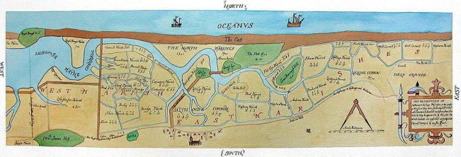
Salthouse ancient channel map made by Surveyor John Hunt in 1649.
As an Index, your site helps users gain deeper understanding of things they already know something about.
Indexes are good for looking things up.
When we say “index”, it can look like what you would expect at a back of a book. But really an index is really a way to find a specific kind of element using a defined lookup system. A rolodex or address book is an index. So, too, is a card catalog.
Jack L. Warner’s Address Book, National Museum of American History
Picking your guide
So if different guides do different things, which is best for your site? One way to start this discussion is to look at your site’s complexity versus your visitor’s expected domain knowledge.
Generally speaking, site owners have a pretty good sense of how complex or rich their content is relative to other competitors or knowledge spaces. You may also have a good sense of the level of domain knowledge visitors have when coming to the site. Those two things can become axes on a chart that maps their combination, as shown below. The three guide strategies are mapped out in the space: signage for less complex spaces with lower domain knowledge, maps for more complex spaces, and index guides for helping people with strong domain knowledge across the entire content complexity range.
Guide Selection Strategies
There are definitely overlaps, so see these more like clouds or fields rather than hard and fast boundaries. The point, though, is to start the conversation by asking about guidance and need rather than specific solutions. It’s better not to start with “we want search” and instead to first ask:
How will people on this website find things?
Will that way of finding be well served by search?
What is the combination of guide strategies that will work best?
This approach will make whatever strategy you choose much more effective, as you have built it for the needs and context of your content and users.


