"Road Signs" by Patrick_worldwide
Summary: Daniel digs into a familiar website navigational guide: directional signage. When is this strategy most useful? What kinds of sites use it well?
Sites need guides, the friendly voice helping people discover spaces where they can learn, work, and play. Most sites try to do this by adding 3 major navigation strategies: directional signage, maps, and indexes.
Previously we gave an overview of each of these guide strategies, along with some pointers about how you can pick the right one for your site. This post gets into more detail about the classic and original web navigation guide: directional signage. Signage is most important when the goal of a site is to help users select or discover. In other words, it helps users uncover more about the range of available topics and learn about the concept space.
Directional signage: To select, to understand
Directional signage guidance gets you to a place in the world. This guidance helps users with lower domain expertise to find their way. The top-level structure should be optimized for each type of user, with invitations to learn more about topics at the pace that fits each user’s needs.
A site’s navigation browsing is the classic example of street signage. Good navigation headers provide users with less domain knowledge and experience keys for where they can go to learn more or decide how to learn more.
These kinds of guides are becoming less common as people arriving at sites have deeper knowledge of what lies within. But they are still critical for introductions to complex or large spaces. Government websites provide some of the best examples of good top-level navigation. The city of Ann Arbor, Michigan for example, has a 2-level navigation guide: one with top-level concepts, one with calls for frequent user needs.
a2gov.org Home Page
The top-level navigation breaks down to secondary navigation that continues the invitation to learn and discover, using simple terms in relatively small menus.
City of Ann Arbor Navigation
This is an exemplary example of a navigation guide.
Is directional signage the right guide for you?
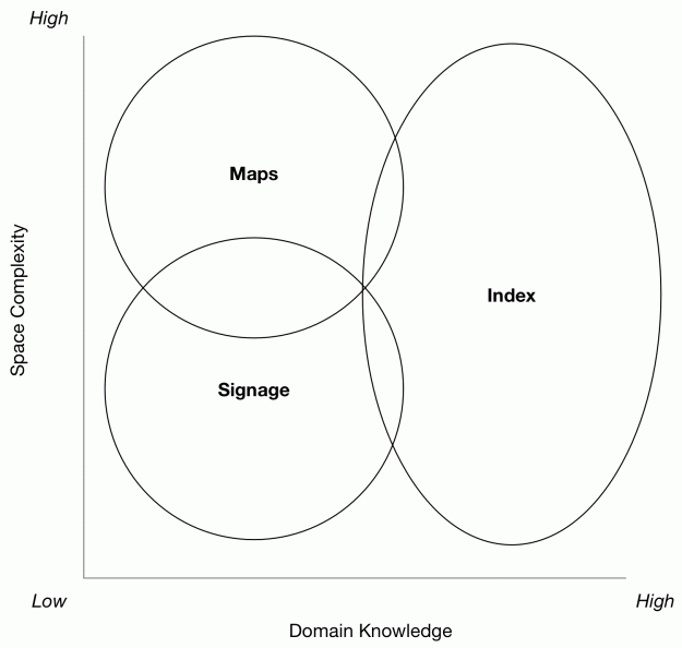
Sites rarely just need a single guide, but they should probably develop and extend them based on the specific needs of their audience and the content at hand. We usually start with a combination of a site’s complexity and the user’s domain knowledge:
Guide Selection Strategies
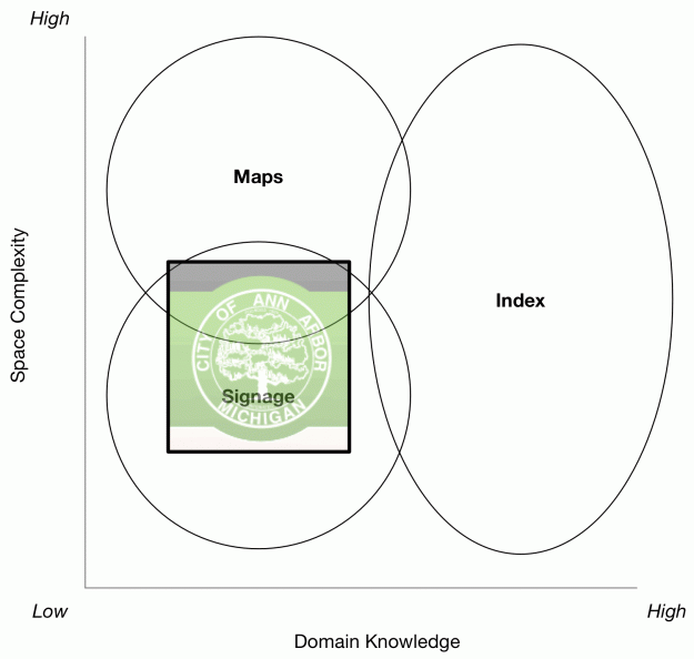
A good assumption about anyone coming to a government site is that their domain knowledge will be low, at least relative to the space and breadth of the domain at hand. The space complexity here, while it seems to be high, is actually pretty straightforward. Local government involves elections; payment for taxes, fines, and utilities; and using the city services. So the space “complexity” underneath can be high, but getting people to those places is fairly low.
A Typical City Government Site in the Decision Matrix
This is a fun exercise for other government sites, or any dense informational site. Where would the IRS site go? How about a typical DMV site? How’s your local school district’s website doing?
Note also that the Ann Arbor site still needs indexes—as supplied by a search box—for higher knowledge folks. While it doesn’t have a “map” per se, the detailed and structured nature of the drop-down menus does provide some context that is implicitly contextual.
Details about how to make good navigation elements are all over the internet; one of our favorites is Stephanie Lin’s The Rules for Modern Navigation, but there are many excellent sources and resources for learning how to build good navigation. If you would like to talk more about how to approach this strategy and organize your content, give us a call; we can help get you started in the right direction.


