Richard Saul Wurman loves dummies.
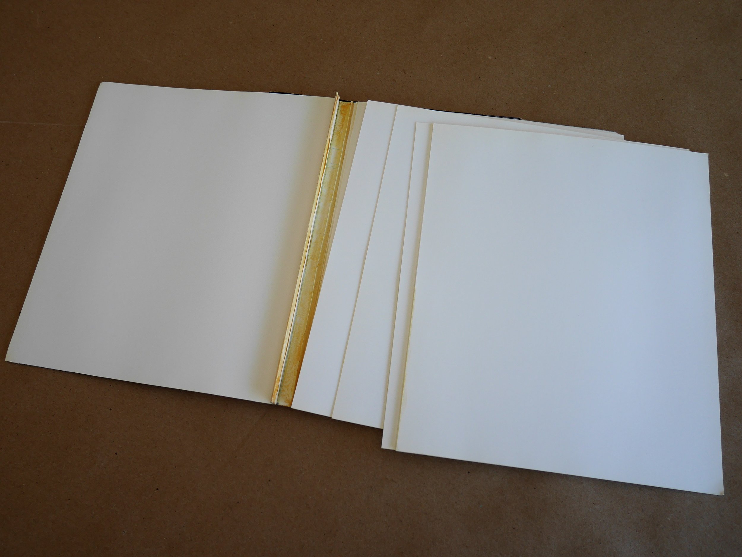
He always makes a “binding dummy” when he’s working on a book. I’ve seen him do it a few times now: he calls the print and copy department at Office Max (or wherever), and has them cut and glue a block of blank sheets of paper to his spec. More than once, he had to tell them what he wanted “was like a custom pad of paper” to help them understand what he was asking for.
He was asking for a dummy.
As I reflect on what I’ve observed in RSW’s process of causing an idea to turn into a published book, and about the similarities and differences in what he’s doing with dummies, and what user experience designers and information architects do when we make prototypes, I wonder: are RSW’s dummies and our prototypes the same thing?
Case Study: Nathan Shedroff’s SMART Yellow Pages Dummies
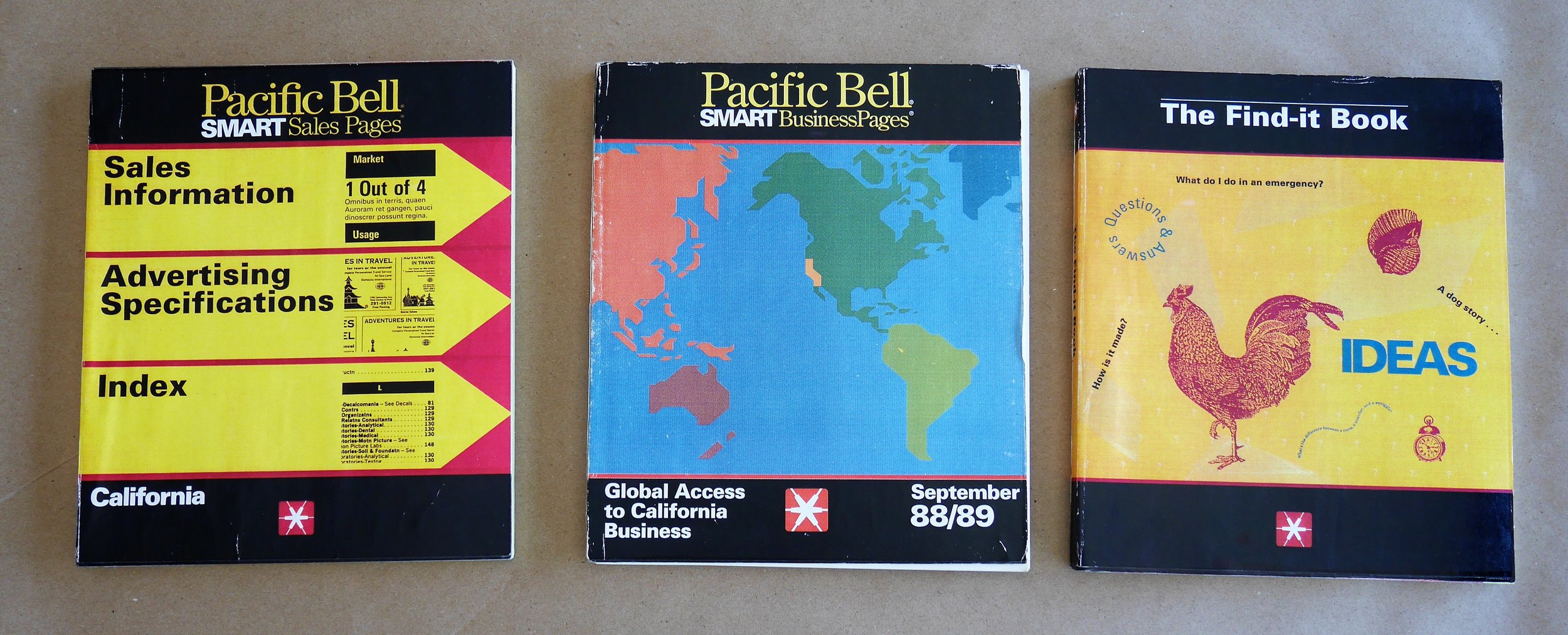
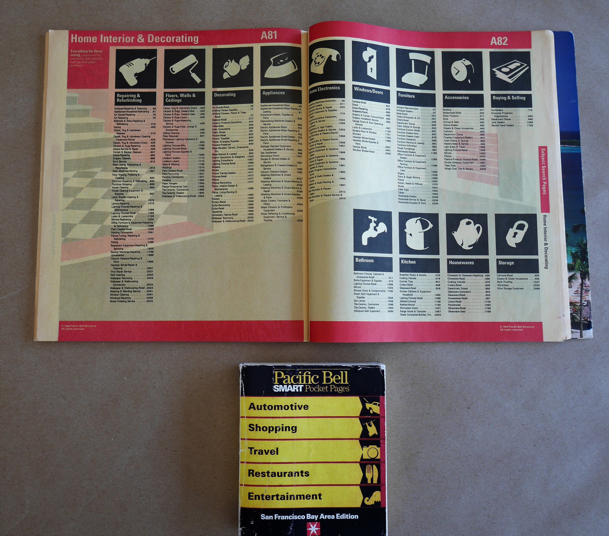
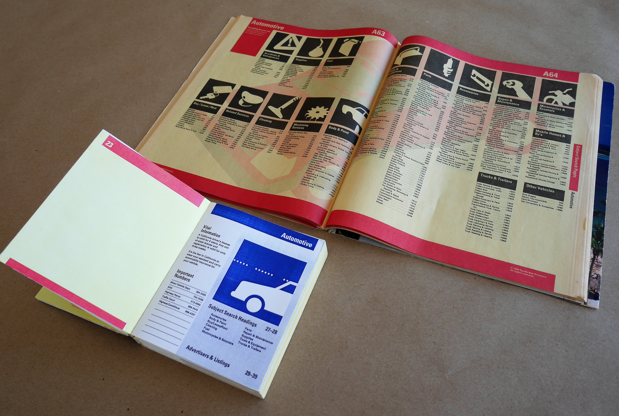
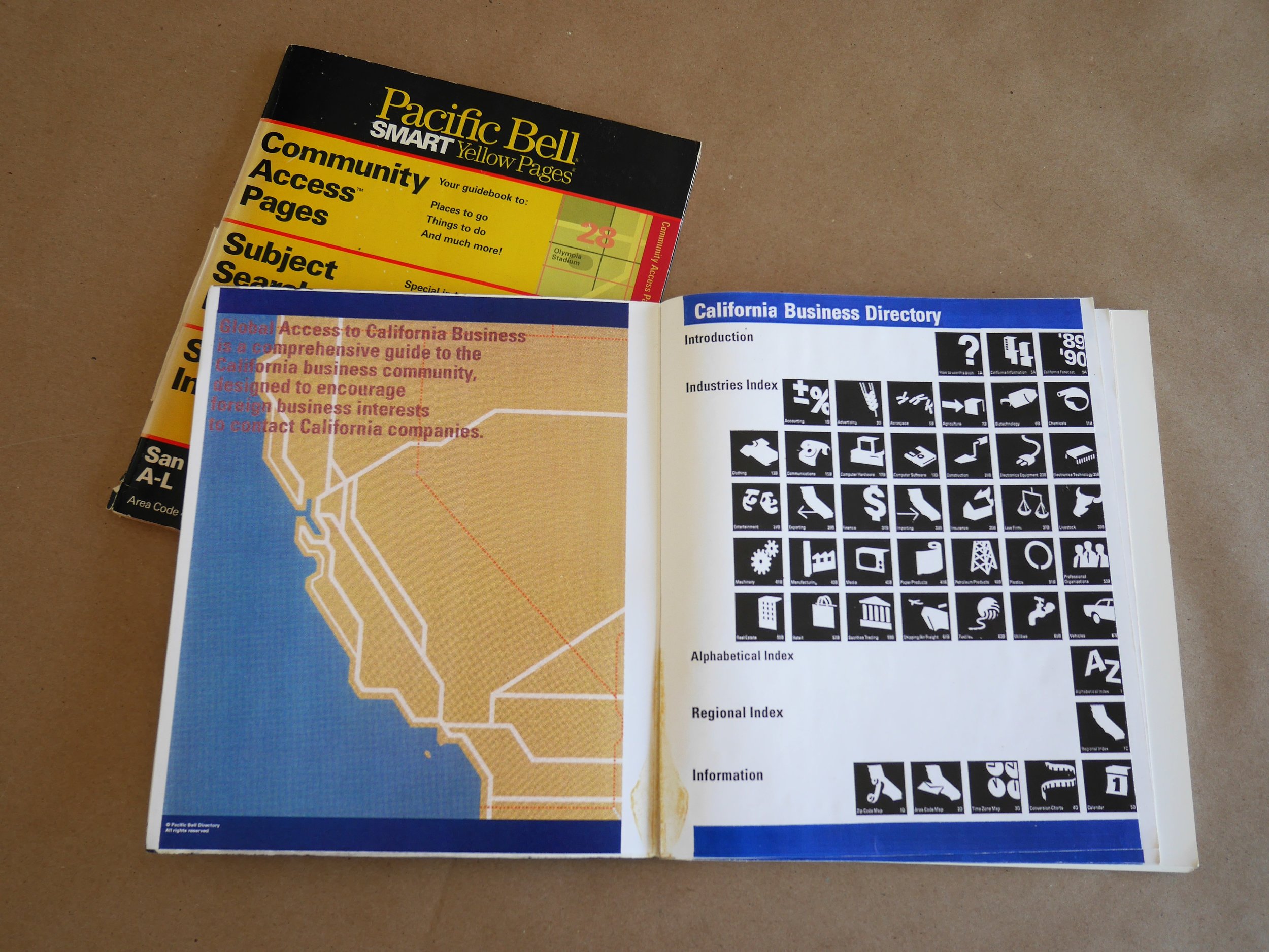
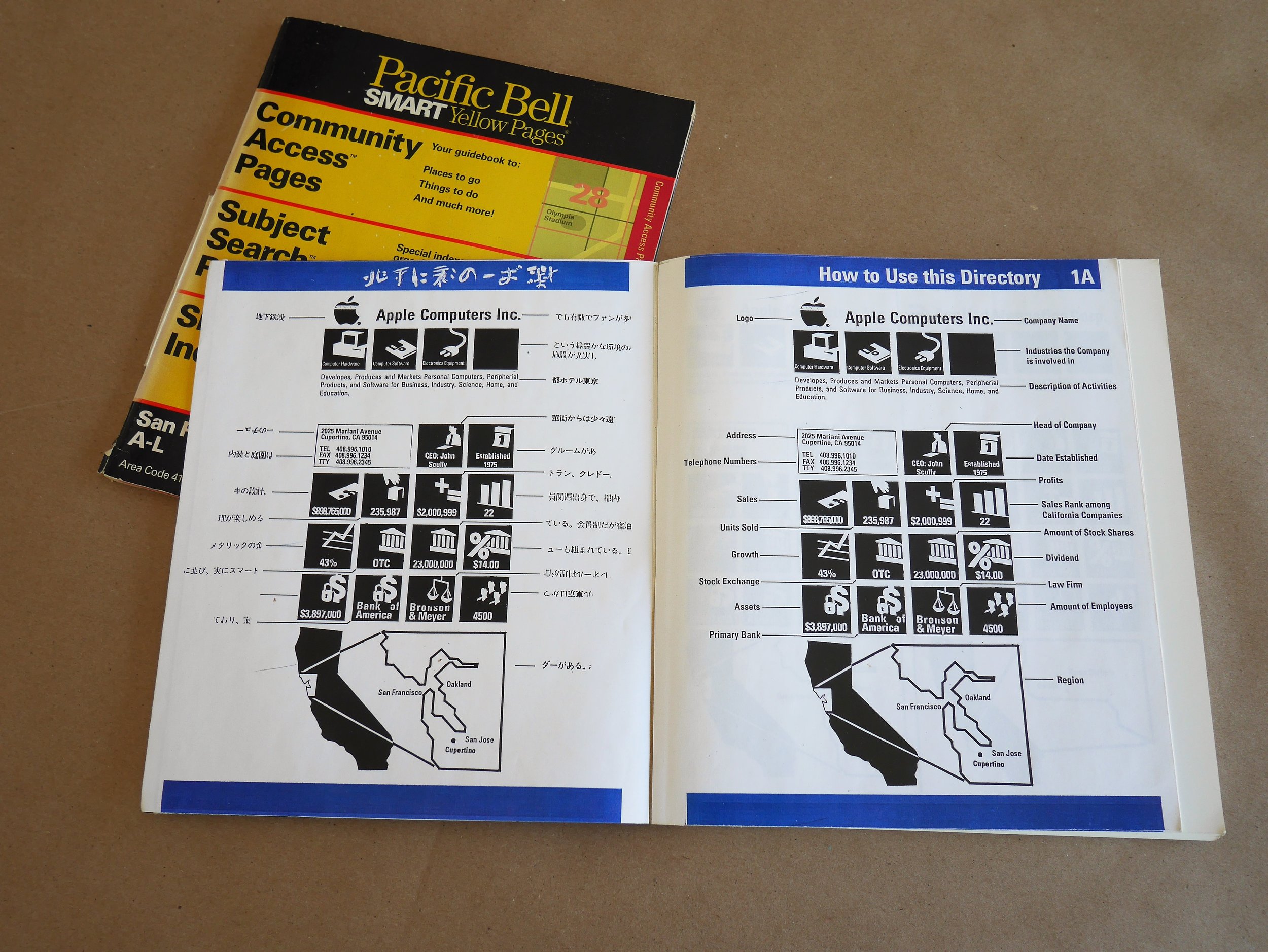
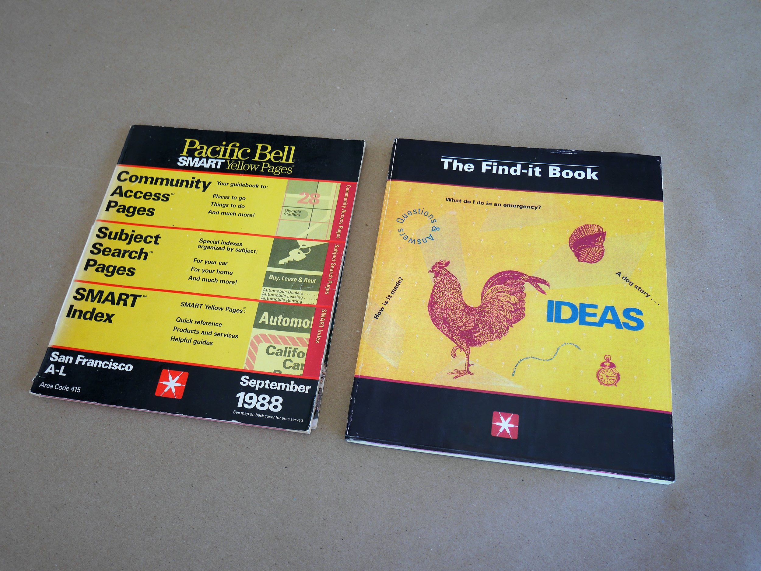
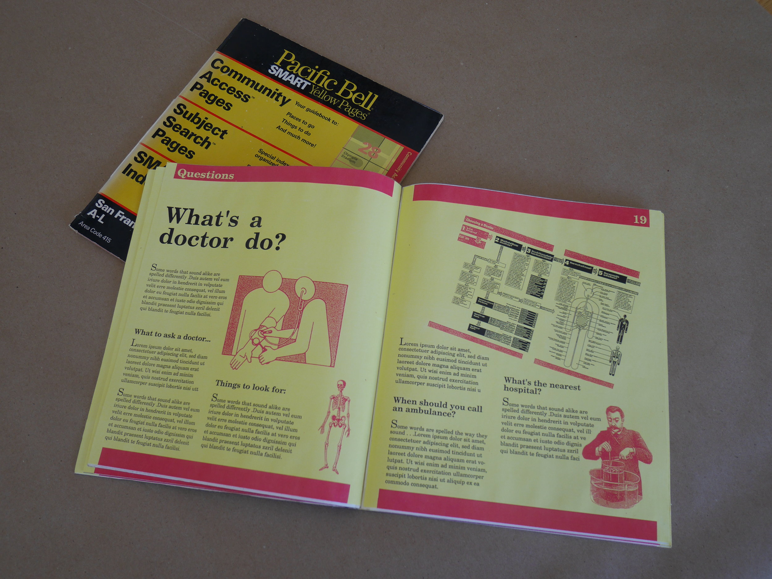
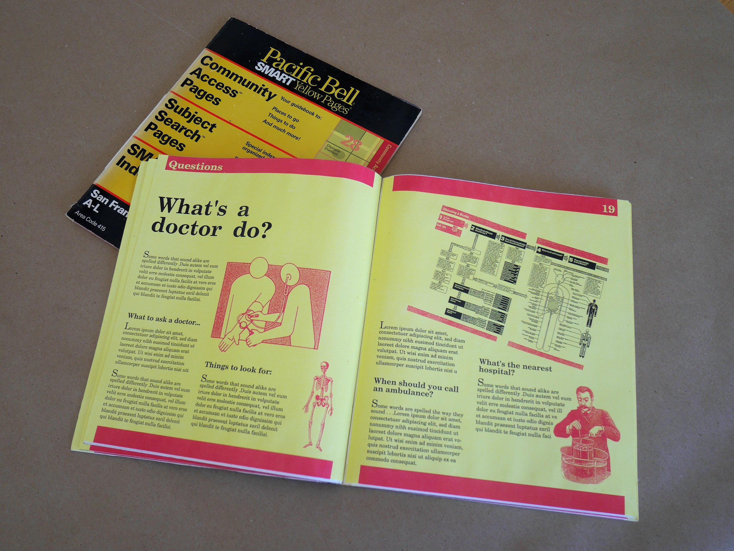
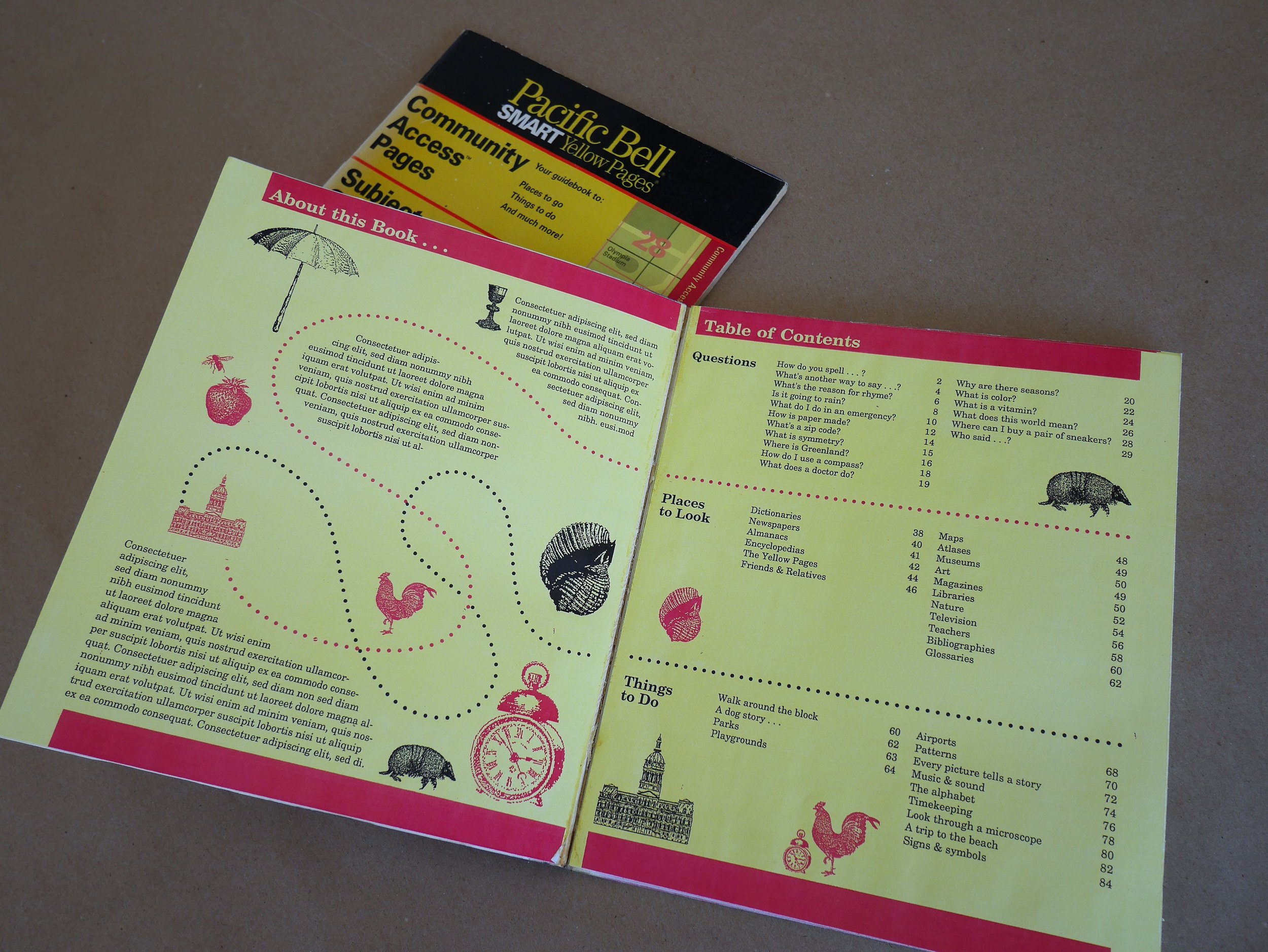
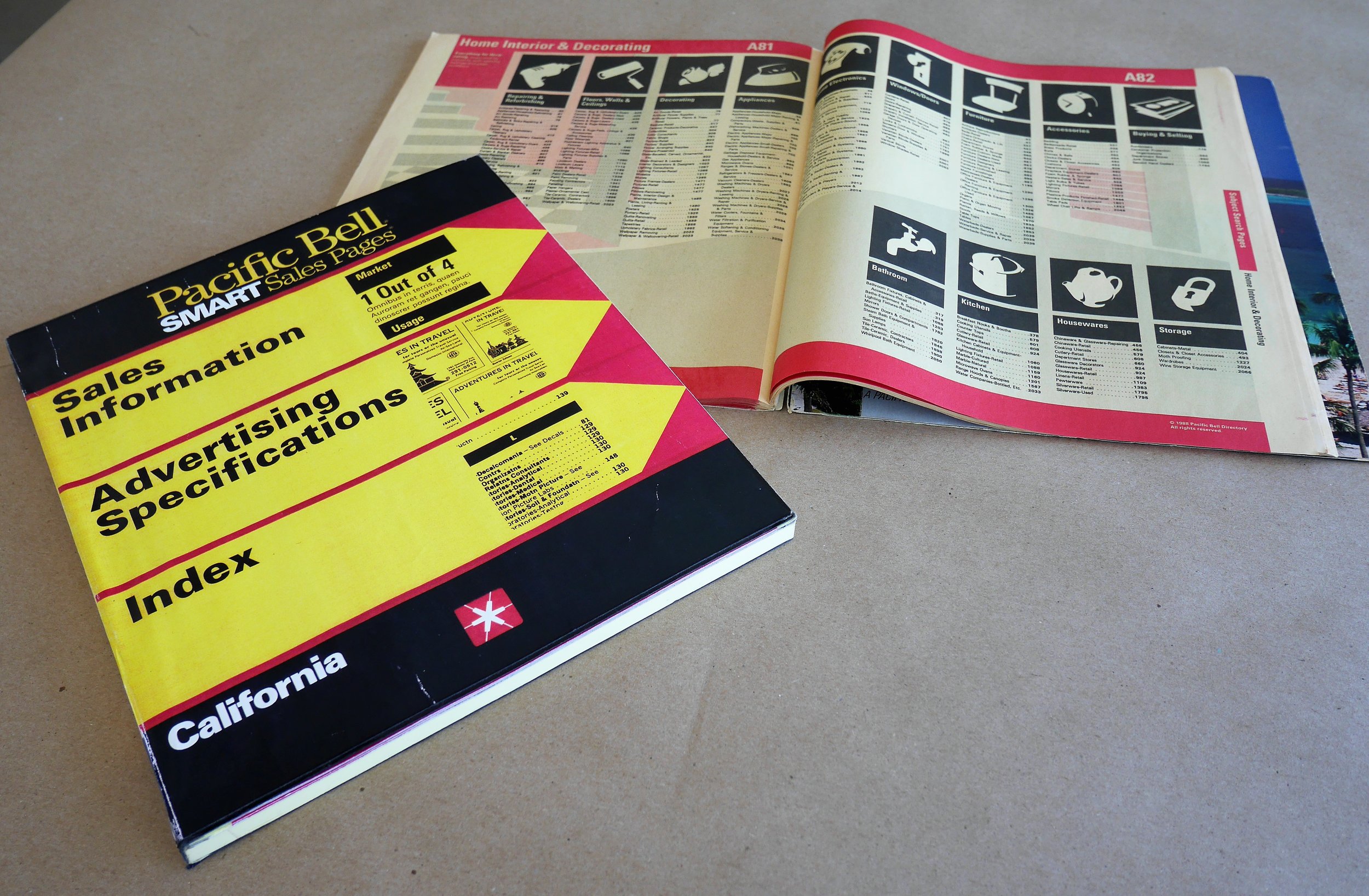
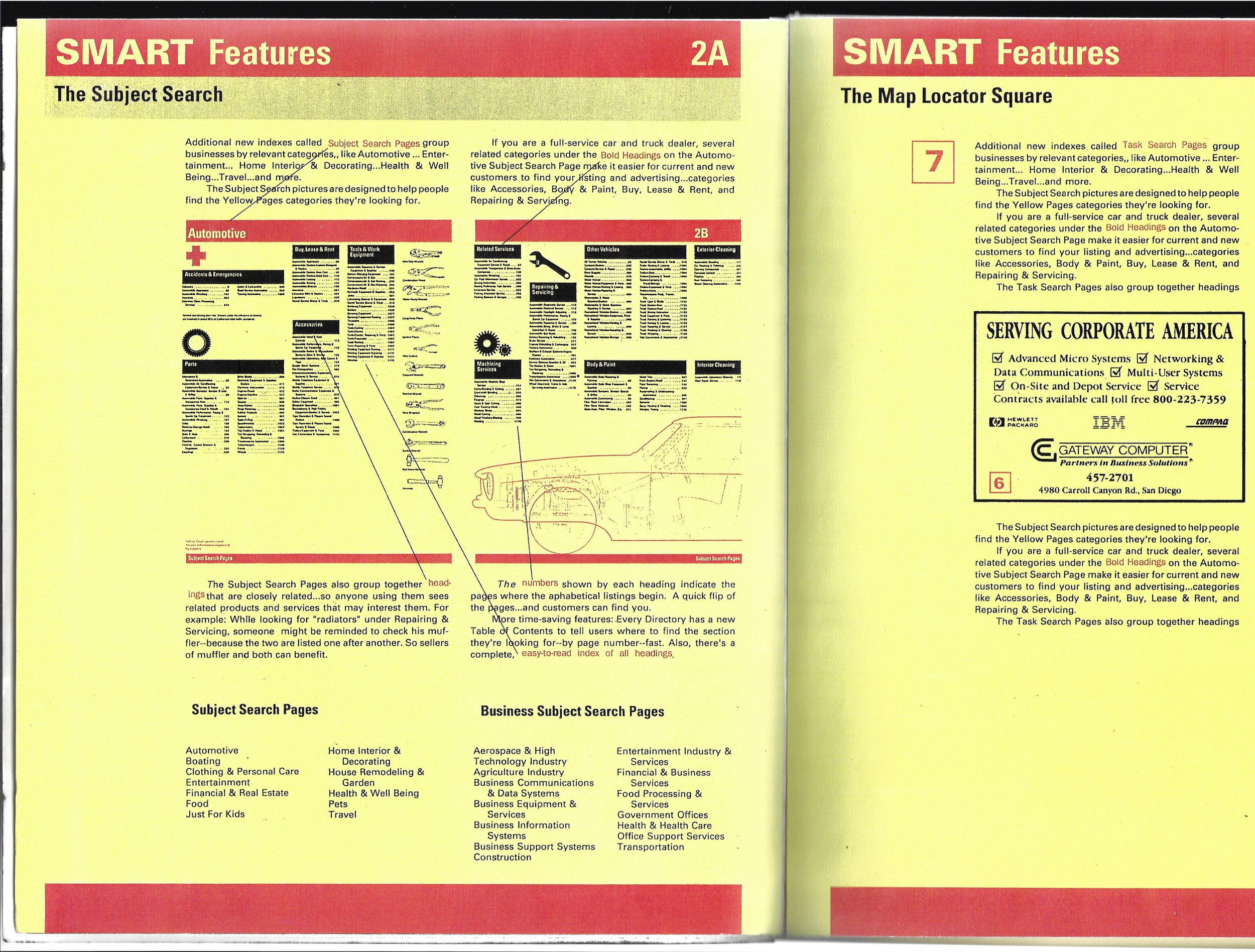
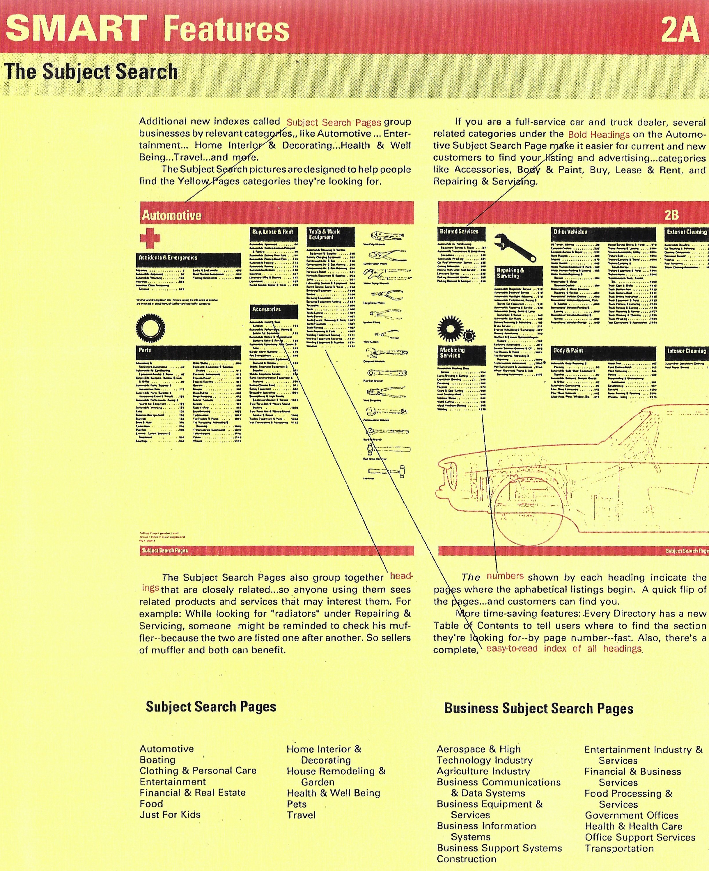
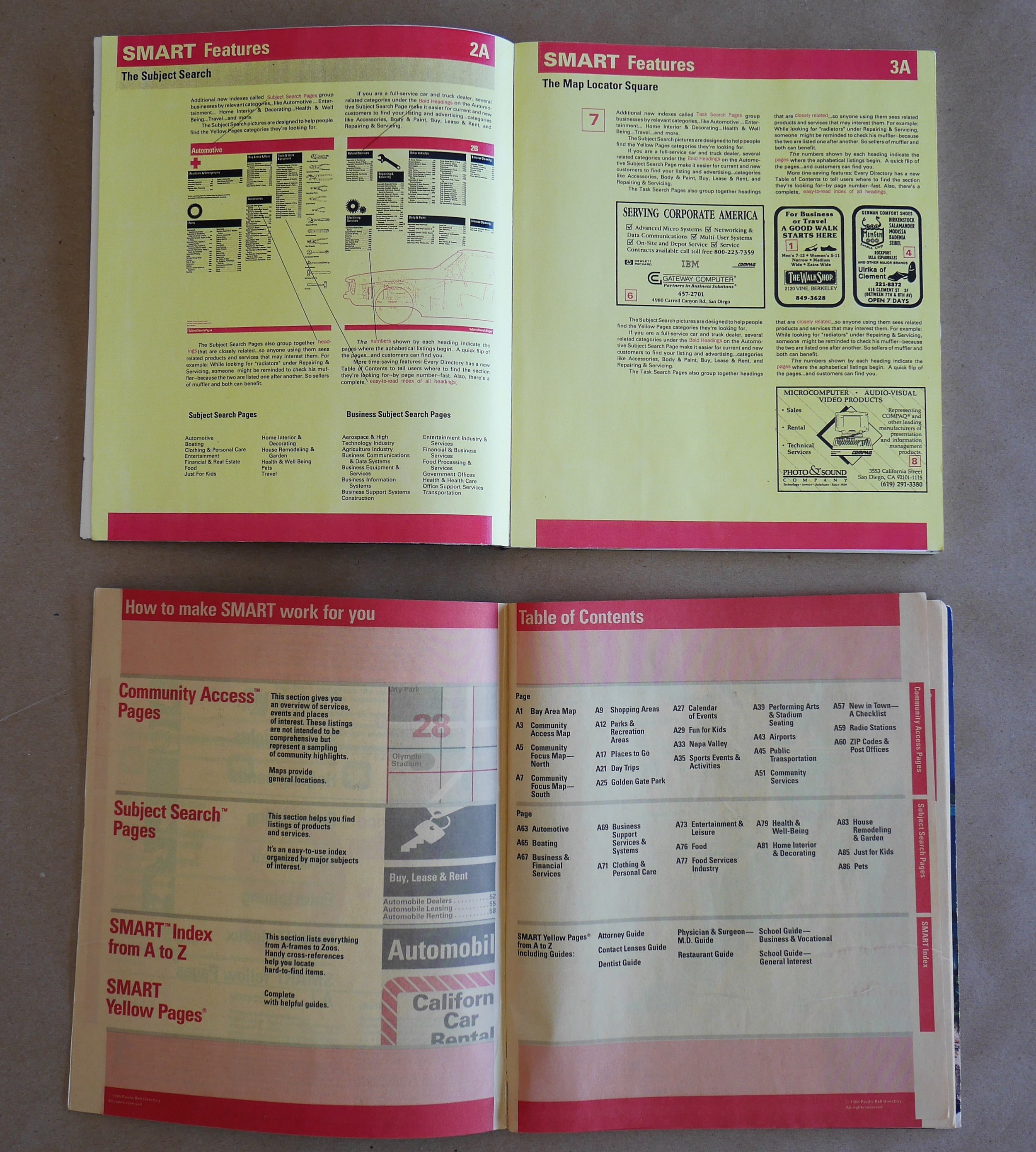
The gallery below contains photos that I shot of binding dummies that Nathan Shedroff saved from the time when he worked for Wurman at The Understanding Business (TUB) in San Francisco, circa 1987. Of all the RSW innovations I’m writing about, and trying to measure in terms of impact on end-users, the 3 years of work that TUB did for the Pacific Bell telephone company’s Yellow Pages division will be near or at the top of the list.
That’s right. RSW’s work on a redesign of the yellow pages in the 6-year interval between the 1st and 2nd TED conferences is likely, when the measurements are checked and double-checked, to have touched a greater slice of humanity than all of the TED content and conferences during Wurman’s 18 year tenure as TED chairman.
In 1987, 29 million copies of Wurman’s SMART Yellow Pages were distributed in California alone. For scale, the Irish rock band U2 sold 25 million copies of The Joshua Tree in 1987, worldwide. According to the case study on the project published in Communication Arts in 1988, 31 billion pages of information came out of TUB’s project with Pacific Bell.
The 4 binding dummies Shedroff let me borrow and photograph were new product concepts that TUB was bringing to Pacific Bell, for projects that were not included in the scope of their 3-year contract to design and publish the “regular” yellow pages. As a small consultancy owner myself, I love seeing how RSW managed and nurtured his account relationship with the phone company by bringing the client his ideas for new business opportunities.
(And as a historian, I must note that I’ve not yet confirmed how many of these turned into real projects.)
“What I was trying to do was figure out a way to change Pacific Bell Directory from a storage company to a content company and to make the book a pro-active dictionary to everything that’s around us”
The 1st dummy Nathan brought me helps elaborate the concept of a “Pocket Pages” version of the SMART Yellow Pages. This edition would be for keeping in the car, or tucking into a purse or backpack. The information it offers is a sub-set of the standard edition, subtracting categories like “home repair” and emphasizing the information one needs while on the go.
A 2nd dummy from Nathan’s archives was part of a pitch for making a new guide called the SMART Business Pages, for use by companies overseas who were looking to establish a presence in California. For this dummy to “say” what it was supposed to “tell” the person examining it, Mr. Shedroff and his colleagues needed to mock up several interior spreads to show how the standard set of English-based icons would be redesigned to make them more legible and understandable to an international audience.
The 3rd dummy Nathan shared with me was part of a pitch for a version of the yellow pages aimed at kids. It was sub-titled “The Find-It Book,” and from my peculiar vantage point of knowing about and collecting most everything RSW did in the years leading up to the work for the phone company in California, I can’t help but see this idea for a kid-focused yellow pages as a kind of call-back to the last print project Wurman did as part of Murphy Levy Wurman in Philadelphia in 1975: the Yellow Pages Career Library.
While I’m at it, I must note that in 1972, RSW did still another project that used the words “yellow pages” (The Yellow Pages of Learning Resources), during the development of which he learned that, in spite of a cease-and-desist letter from the phone company, “the yellow pages” is in the public domain as a turn of phrase. When I asked Amazon’s Alexa about the provenance of “the yellow pages,” she told me that a printer in the 1880s ran out of white paper while printing an early telephone directory, and that the color/name have been ubiquitous ever since.
The last of the dummies Nathan brought me is a guidebook for salespeople, to help them appreciate the new features of the SMART Yellow Pages and to then be more effective when selling customers on all the new ways they could show up in the directory.
“Nobody dreams about the phone book, much less about improvement.”
“We took a product that no one wanted to touch—after all, the Yellow Pages were usable already—and made the phone companies millions. It was a tremendous success.”
It would be an abuse of historical context if I were to take RSW’s quote about the phone book being “a product that nobody wanted to touch” and just run with it into the end-zone of the overall point I’m trying to make here about the importance of these binding dummies. The temptation looms, though, because the human being’s sense of touch is ultimately what these dummies are all about. It’s the reason that RSW always does his work this way.
Binding dummies are, as I’ve seen RSW use them in his last 3 projects, more about feeling the weight of the object, and transferring the feeling of heft into confidence in the solidity of the idea, and the feasibility of its being realized, than about selling a visual presentation. Binding dummies “work” because they invite the beholder to place the dummy next to some other object for comparison, and in so doing, to develop an immediate and personal understanding of the new entity. Binding dummies provide an embodied basis from which the designer can answer questions of the sort that Buckminster Fuller so befuddled lesser architects with when he asked them: how much does your building weigh?
In these ways, Wurman’s binding dummies may not be so different than the low-to-medium fidelity prototypes designers in digital make to help move projects along from concepts into products. Mocked-up, but “clickable” interface prototypes allow our ideas for a product to be made tangible in ways that folks who aren’t on the design team can appreciate and evaluate, using criteria that includes what it looks like, but yet doesn’t emphasize the visual too much.
A fundamental difference in what Wurman does with binding dummies, compared with what interactive designers do with clickable prototypes, has to do with the question of for whom the ideas and concepts are being rendered intelligible. Quite frequently in digital design, stakeholders are shown footage of end-users interacting with prototypes as part of a research effort to prove “product/market fit.” In UX, the success and utility of the prototype depends on the interaction between the mockup and a person who represents or is the kind of end-customer the product is supposed to be good for. Wurman’s binding dummies, in vivid contrast, are successful and useful to the extent that stakeholders interact with them. Directly.
In both cases, what’s happening with the dummy or the prototype is—to my way of thinking—ultimately a process of possession. And the choice to make a dummy or a prototype, by the same reasoning, is a choice to tap into and leverage the embodied phenomena that are involved in a person taking possession of a thing.
Consider what Paco Underhill says about the process and phenomena around possession in his seminal book The Science of Shopping (1999):
“If you still don’t believe all this, go to the home of a product fairly unconcerned with matters of smell, touch or any other sensual experience—a bookstore. There you’ll be treated to the sight of shoppers stroking, rubbing, hefting and otherwise experiencing the physical nature of a product where no physical attribute (aside maybe from typeface size) has anything to do with enjoyment. Still, helplessly, we touch.
Here’s a final reason touch is so important. When does a shopper actually possess something? Possession begins when a shopper’s senses begin to latch on to the object. It begins in the eyes and then in the touch. Once the thing is in your hand, or on your back, or in your mouth, you can be said to have begun the process of taking it.”
In every instance that I’ve observed RSW using binding dummies, it’s in service of helping a gatekeeper for the project provide their permission to continue. To unlock a more profound next step. And it seems to me that possession provides a compelling pretext to receiving such permission.
And while there’s nothing to see here, or anywhere else in Wurman’s oeuvre, about testing a prototype or dummy with end-users,* I think information architects and UX folks can take some helpful cues from RSW’s obsessive focus on connecting well with stakeholders through an artifact that “talks” even while being dumb. Getting gatekeepers to interact with a prototype themselves, to enable an experience with the heft, and dimensions, and tangibility of a nascent idea that’s not proxied through observation of another’s use.
In reviewing a draft of what I’ve observed so-far, Mr. Shedroff shared the following:
I think you’ve touched on a fact that rarely gets discussed. “Prototype" isn’t a black and white category, it’s a spectrum. For a physical product like a book, it’s on one end of the spectrum that then steps to comp and then jumps to gallery and then, perhaps, to finished product. In industrial design, the dummy might be a sketch prototype, and then a “proof-of-concept” followed by a series of progressively more detailed and designed prototypes (the last of which are “working” in some capacities) until you get manufacturing prototypes, the real thing, and THEN the later real things as adjustments are made on the assembly line well after introduction (friends at ______ say to NEVER buy a new product the day it’s first available. There may be hundreds of adjustments that improve the quality within the first 3 weeks alone.
For digital products, the scale might start (again) at “proof of concept” where something is Photoshopped for a screen in a pitch deck, perhaps, then sketch interfaces, visual interfaces, wireframes, interactive sketches, working code, refined interfaces for user and then quality assurance testing, etc. All of these could be called “prototypes.”
This creates a lot of confusion just within the development groups, let alone with non-designers, non-engineers, and non-product managers who might mistake any of these along the way for something ”real.”
* RSW does not believe in testing products with end users. Ever. Once, in what I’m certain was an unconscious parallel to Salvador Dali’s famous response after having been asked about using drugs, Richard said to me “I am the mall intercept.”

