Summary: Information architects Kaarin Hoff and Andrew Hinton share how to use conceptual models to aid understanding when planning for a digital environment.
Andrew and Kaarin spoke at a Detroit UX Meetup about conceptual modeling in 2015, and this content is still very relevant. Please enjoy a blog-friendly version of their notes.
Many Kinds Of Models
1. Hi! We’re here to talk about how practical modeling helps make sense of design by making invisible things visible. It’s part of a workshop we’re developing with our fellow information architect and TUG colleague Joe Elmendorf.
Slide 2—Many types of models
2. There are many sorts of modeling, including things like physical scale models of buildings, mathematical and statistical models. These overlap in many ways. But we’re talking about conceptual modeling.
3. Conceptual models help us do some important things really well, like
– Make concepts into visual objects we can manipulate
– Allow us to explore their relationships
– Let us work with parts and aspects of complex systems
Slide 4—Comparing models and interfaces
4. We see Models on a sort of continuum with Interfaces. For digital design work, the ultimate goal is usually to create some kind of interface. But models can do things that the specifics of interfaces can’t. Models are a way to work through questions about relationships and ideas, without being tangled in the specifics of interaction.
5. Both of them help us determine what we are making, but they’re better at different challenges. Some questions are better answered at one end of the spectrum than the other.
6. We emphasize this is ‘practical modeling’ because there’s a misconception that conceptual work isn’t practical. But, in fact, all these approaches are practical, when used for the right purposes.
Slide 7—What we think shapes what we make
7. Ultimately, the way we conceive of concepts and their relationships creates structures we use for making the final product—whether we realize it or not. So why not make them visible and work with them on purpose?
Slide 8—Models facilitate collaboration
8. When we rush ahead it often causes more work in the end. Thoughtfully producing a model to guide a conversation at the beginning of a project can help avoid a lot of this pain. It helps us gain a shared understanding, and get everyone going in a similar direction. Modeling priorities allows us to arrange them and focus on the right parts in the right order. It helps us discover assumptions that could trip us up later, and it especially helps map systemic scale and complexity.
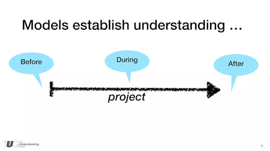
Slide 9—Models are tools of communication for the entire journey
9. Another misconception is that modeling is only useful at the beginning of a project. But we’ve found that models used at the beginning continue to be used and updated throughout the work, and even after something has been launched.
Examples Of Conceptual Modeling
10. Let’s look at some examples of what we mean—these are various sorts of models we (Kaarin or Andrew) have worked with in our own projects.
Slide 11—Grouping and relating the elements of the system
11. This is an information model that exposes all the pieces, parts, actors, and shows how they interconnect. This can be used as a discovery tool and a discussion tool. We have often created these models collaboratively with clients. One client recently told us they still refer to the info model on their wall daily (we haven’t worked with that client for 1.5 years)!
Slide 12—A model for stakeholder IA strategy
12. A major non-profit was enhancing its site’s purpose by creating a huge resource library and home management applications. This simple diagram helped get alignment among stakeholders about the equal weight of each of those purposes, and how they would be integrated.
Slide 13—Focusing on user needs with a workflow model
13. This student flow was created for a higher ed client. It helped us discuss the need to break the department-based structure of the website to focus on the audience member’s main needs throughout their university experience.
Slide 14—A high-level representation of the user’s journey from shopping to purchasing
14. This model helped establish an understanding of the behavior patterns shoppers have in just about any retail situation, and the essential functions a site needs to accommodate each category of behavior. It’s not a site map, it’s not a wireframe, and not exactly a user journey — but it establishes structure that guides many design decisions.
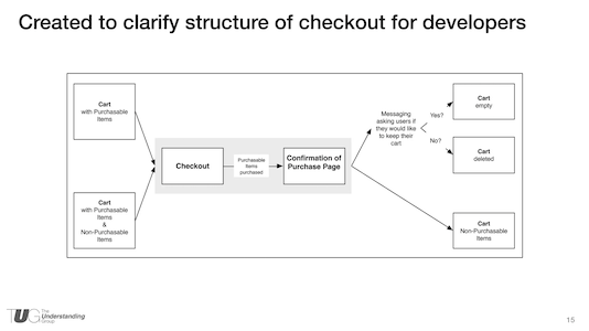
Slide 15—A picture IS worth 1000 words. This model created clarity for software developers in the middle of a meeting
15. Sometimes you don’t have the model at the beginning, but you can still use one to make sense of the work. This model was thrown together in a meeting when we already had pixel-perfect comps, annotated detail wireframes, but we still lacked alignment on what was happening behind the scenes. This model cleared up the confusion quicker than any conversation could had, plus it was able to be referred to later, unlike conversation.
16. Last, we want to share one way in which models can go from very abstract to much more concrete.
Slide 17—Circles keep ideas and conversation flowing
17. You’ll notice that we have a lot of circle-shaped blobs in some of these. When we start trying to figure out new things, we often start with circles.
Circles don’t have sides, so they don’t imply any particular direction or order. They let us move them around more easily than squares. As things get more figured out, they become more square.
Slide 18—Bubble diagrams help architects plan physical spaces
18. It turns out, even built-environment architects often start by scribbling bubbles and blobs on paper to work out the relationships between all the elements they need to compose into a coherent system — before deciding where walls or doors should go.
Slide 19—Bubble diagrams and floor plans are abstractions in designing a home
19. But even a floor plan is still an abstract model. While it’s more literal than the blobs, if you look closely, it’s still mainly just doing the work of establishing the definitions and relationships between the main functional areas of a structure.
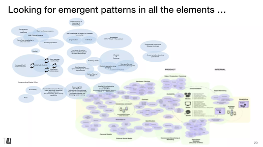
Slide 20—Clustering to visualize affinities
20. We often start with bubbles and blobs in a similar way, even if what we’re designing is digital. It gets all the elements on the table as objects we can move around, and show relationships between. They allow us to find emergent patterns and dynamics.
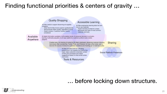
Slide 21—Stakeholder priorities emerging as the affinities coalesce
21. Often, the blobs coalesce—sort of like mercury merging into bigger globules—that help us identify the primary purposes of a new product, service, or environment. These become a way to represent the big priorities and decisions that stakeholders or even team members are aligned on. And it does this without debates about what should go in the global navigation or what color the menus should be.
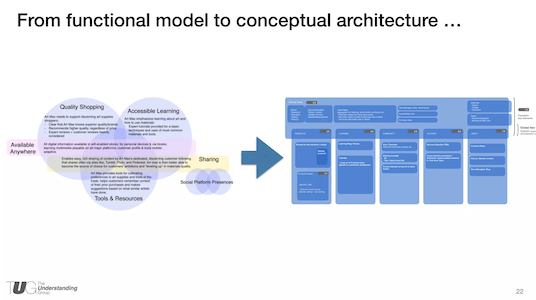
Slide 22—The site structure emerged from the functional model
22. More often than not, we find this sort of approach helps us discover the ultimate structure something can have—such as the navigation structure of a website or search application. The example on the right is a site structure diagram, but it’s more like a floor plan than a flow chart—it establishes places and their relationships, much like in building architecture.
Because a lot of the bigger questions have already been settled, the conceptual architecture isn’t a big surprise—in fact, it often just feels inevitable, rather than unsettled and up for debate. After this, we can better focus on the finer points of detailed structure and interaction design, without disruptive surprise
Modeling Is A Kind Of Making
23. To conclude, here are a few thoughts to leave behind: Modeling is a kind of making; rather than the craft of an object or interface, it’s the craft of understanding. It can work at many levels of fidelity—from abstract blobs to specific structures. Even if you aren’t included in the beginning strategy or architecture work of a project, modeling is still a powerful tool for helping figure out big or complex systems and find shared understanding.
24. Thanks!
Want to Learn More About Making Models?
If you’re interested in learning more, please see our current workshops!
Complete Slide Deck
Practical Conceptual Modeling at UX Detroit Feb 2015 from Andrew Hinton


