Personas for user experience are a proven tool to help us overcome internal biases and understand what it takes to address the needs of multiple audiences.
Read moreForm Follows Forces
Summary: Dan Klyn and Abby Covert speak on working out problems of form, structure, and meaning in user experience, expressed as "form follows forces."
Below is the full text of the first part of the joint keynote presentation that Abby Covert and I gave at World IA Day in Ann Arbor in February of 2014.
Last year at World IA Day NYC, my co-presenter Abby Covert conducted an on-stage interview with Lou Rosenfeld about the history of information architecture, and Lou prefaced his comments with an observation that I’d like to re-iterate here in Ann Arbor today.
We’re living and working in extraordinary times, akin to those of the beginning of the Industrial Revolution.
We’re living in the midst of a change in human culture as monumental as that of the Industrial Revolution. When viewed from the timescale of history, we’re still in the first few hours of the first day of a new era.
And as was the case at the beginning of the Industrial Revolution, the ways of the “old” world and the ways of the “new” world are all smeared together. Horses and cars at the same time.
I made this observation to my friend Hassan Hodges a few weeks ago, and he told me to look up the “horsey horseless.”
This is us now—fumbling for forms for the things we make that work in the actual world. In a world where the horses get scared by the cars.
It’s normal and natural and ok that most everything we’ve made in our infancy with these new media from the “new” world are goofy things that don’t really work.
But I don’t want to make goofy things forever. I want to get beyond horsey horseless. But how do you do that? How do you get to forms that work for the new world without re-creating the problems of the old one?
Denise Scott Brown has observed that “faced with the unmeasurable, people steer their way by magic.”
I don’t believe in magic. So one of the ways I’ve navigated all this is to look to and follow a figurehead—someone who’s seemed to master the unmeasurable, and who’s done and doing good work. What would they do?
What would Richard Saul Wurman do?
“It’s not enough in this moment in fast-moving history to make just a better version of what has happened before… its going to work for a while, so it’s going to fool people… but nothing goes on forever—they’re going to have to go backwards to find some new beginnings to branch out from.”
Just an improved version of what came before isn’t enough. Mr. Wurman recommends that we go backward to find new beginnings. Back to a place before the pre-conceptions about structure and meaning that are operative in web design and user experience today.
I had my graduate students doing this last fall in SI658, looking back at the ways people have thought about and practiced architecture in the built environment and digging into how it came to be that movements like beaux-arts provided a way for designers to know how form and structure and meaning ought to be worked out.
With modernism, the guidance for working out problems of form and structure and meaning is stated as a maxim: form follows function.
This is the Glass House by Philip Johnson, and part of why the form of this structure is able to be so pleasing is because the functional requirements here have been simplified to the point of nonexistence.
Nobody lives in this house. Its not for living, it’s for photographing, and for the paying of homage to Mies van de Rohe, whose maxim was “less is more.”
Form follows function works best when function is hyper-simplified. Like Pinterest. Modernist approaches to structural form are appealing because everything is in its right place.
The reaction to modernism’s strict rules for selecting a structural form and working out its relation to function and meaning is called postmodernism—where form *flouts* function. In contrast with modernism’s “everything in its place” this is “whatever, all over the place.”
In between the strictness of “everything in its place” modernism and “everything all over the place” postmodernism is a weird micro-movement called mannerism. The mannerist maxim is “less is a bore.” Its approach to balancing form and meaning and function is through an embrace of human complexity and contradiction.
This is the Sanisbury wing of the National Gallery in London, on Trafalgar Square—a triumph of mannerist architecture and place-making by the American architects Venturi and Scott Brown.
Venturi and Scott Brown’s mannerism isn’t an architecture of perfection like modernism, nor an architecture that denies the possibility of universal guiding principles, like postmodernism. The highest praise for or from a mannerist in the tradition of Venturi and Scott Brown would be to say that the work is “almost all right.”
The Sainsbury wing is almost all right because it fits into its context on Trafalgar Square. In an almost seamless way. But it’s not seamless. It’s seamful. When you notice what the building is doing, that’s on purpose. There’s meaning in the breaks in the order, and also in the places where the order is not broken.
From the square, the facade of the Sainsbury wing appears to be of a piece with the beaux-arts structure of the main museum. Blends right in.
But then in this stairwell, which is mostly occluded from view on the square, the beaux-arts gives way to high modernism.
And even out on the square, where your first glance assessment is that these buildings are of a piece, and maybe even built at the same time, with a second, closer look you might notice these delightfully colored Egyptian-styled capitals atop the pillars that operate the iron gates that swing into place when the museum is closed. The collision of these three architectural styles and systems of meaning is skillfully balanced by the architects, but never perfectly resolved.
Abby and I quite like mannerism, and the best example in digital space of this almost all right—inconsistent at times and on purpose way of working out form and meaning is Medium, from the makers of blogger.
Medium is a new place on the Internet where people share ideas and stories that are longer than 140 characters and not just for friends. It’s designed for little stories that make your day better and manifestos that change the world.
Turns out, Medium doesn’t let you edit or write these little stories and manifestos on a mobile phone.
On a tablet or PC, fine. But not on mobile. Not because you can’t. Not because offering that functionality is hard or expensive or takes a long time. But because they think you ought not.
They’ve chosen forms for their product’s various expressions that are inconsistent at times and on purpose. Because of reasons. The breaks in the order mean something—teach you something about the service. These forms are almost all right. And they follow the operative forces.
Strategy And Structure
Dan Klyn covers four principles of digital strategy and structure for producing useful and usable online environments.
Read moreMaps, Territories, Language, & Place
Summary: Andrew Hinton spoke at Midwest UX 2013 on how language is central to understanding place, and how we create embodied experiences in software and elsewhere.
I thoroughly enjoyed speaking at this year’s Midwest UX, in glorious Grand Rapids, Michigan (home of one of TUG‘s studios).
As a number of our blog posts about the event will surely mention, the curated theme for this year’s conference was “Place.” What does Place mean to design? How do we create or affect the experience of place?
To that end, I prepared a talk on how language—something we don’t normally think of as especially environmental or physical—is actually central to how we understand place, as well as how we make coherently embodied experiences in software and elsewhere.
Slides below! For easier reading of the notes, use full-screen, or download PDF.
This talk is somewhat related to my earlier post on “Language is Infrastructure,” and gets most of its material from the book I’m slowly completing for O’Reilly Media on designing context.
I’m looking forward to working on this topic even more for events that are coming up in the next year.
Practical Conceptual Modeling
Summary: Information architects Kaarin Hoff and Andrew Hinton share how to use conceptual models to aid understanding when planning for a digital environment.
Andrew and Kaarin spoke at a Detroit UX Meetup about conceptual modeling in 2015, and this content is still very relevant. Please enjoy a blog-friendly version of their notes.
Many Kinds Of Models
1. Hi! We’re here to talk about how practical modeling helps make sense of design by making invisible things visible. It’s part of a workshop we’re developing with our fellow information architect and TUG colleague Joe Elmendorf.
Slide 2—Many types of models
2. There are many sorts of modeling, including things like physical scale models of buildings, mathematical and statistical models. These overlap in many ways. But we’re talking about conceptual modeling.
3. Conceptual models help us do some important things really well, like
– Make concepts into visual objects we can manipulate
– Allow us to explore their relationships
– Let us work with parts and aspects of complex systems
Slide 4—Comparing models and interfaces
4. We see Models on a sort of continuum with Interfaces. For digital design work, the ultimate goal is usually to create some kind of interface. But models can do things that the specifics of interfaces can’t. Models are a way to work through questions about relationships and ideas, without being tangled in the specifics of interaction.
5. Both of them help us determine what we are making, but they’re better at different challenges. Some questions are better answered at one end of the spectrum than the other.
6. We emphasize this is ‘practical modeling’ because there’s a misconception that conceptual work isn’t practical. But, in fact, all these approaches are practical, when used for the right purposes.
Slide 7—What we think shapes what we make
7. Ultimately, the way we conceive of concepts and their relationships creates structures we use for making the final product—whether we realize it or not. So why not make them visible and work with them on purpose?
Slide 8—Models facilitate collaboration
8. When we rush ahead it often causes more work in the end. Thoughtfully producing a model to guide a conversation at the beginning of a project can help avoid a lot of this pain. It helps us gain a shared understanding, and get everyone going in a similar direction. Modeling priorities allows us to arrange them and focus on the right parts in the right order. It helps us discover assumptions that could trip us up later, and it especially helps map systemic scale and complexity.
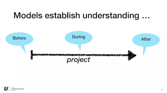
Slide 9—Models are tools of communication for the entire journey
9. Another misconception is that modeling is only useful at the beginning of a project. But we’ve found that models used at the beginning continue to be used and updated throughout the work, and even after something has been launched.
Examples Of Conceptual Modeling
10. Let’s look at some examples of what we mean—these are various sorts of models we (Kaarin or Andrew) have worked with in our own projects.
Slide 11—Grouping and relating the elements of the system
11. This is an information model that exposes all the pieces, parts, actors, and shows how they interconnect. This can be used as a discovery tool and a discussion tool. We have often created these models collaboratively with clients. One client recently told us they still refer to the info model on their wall daily (we haven’t worked with that client for 1.5 years)!
Slide 12—A model for stakeholder IA strategy
12. A major non-profit was enhancing its site’s purpose by creating a huge resource library and home management applications. This simple diagram helped get alignment among stakeholders about the equal weight of each of those purposes, and how they would be integrated.
Slide 13—Focusing on user needs with a workflow model
13. This student flow was created for a higher ed client. It helped us discuss the need to break the department-based structure of the website to focus on the audience member’s main needs throughout their university experience.
Slide 14—A high-level representation of the user’s journey from shopping to purchasing
14. This model helped establish an understanding of the behavior patterns shoppers have in just about any retail situation, and the essential functions a site needs to accommodate each category of behavior. It’s not a site map, it’s not a wireframe, and not exactly a user journey — but it establishes structure that guides many design decisions.
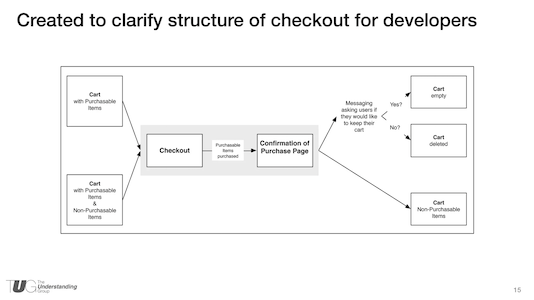
Slide 15—A picture IS worth 1000 words. This model created clarity for software developers in the middle of a meeting
15. Sometimes you don’t have the model at the beginning, but you can still use one to make sense of the work. This model was thrown together in a meeting when we already had pixel-perfect comps, annotated detail wireframes, but we still lacked alignment on what was happening behind the scenes. This model cleared up the confusion quicker than any conversation could had, plus it was able to be referred to later, unlike conversation.
16. Last, we want to share one way in which models can go from very abstract to much more concrete.
Slide 17—Circles keep ideas and conversation flowing
17. You’ll notice that we have a lot of circle-shaped blobs in some of these. When we start trying to figure out new things, we often start with circles.
Circles don’t have sides, so they don’t imply any particular direction or order. They let us move them around more easily than squares. As things get more figured out, they become more square.
Slide 18—Bubble diagrams help architects plan physical spaces
18. It turns out, even built-environment architects often start by scribbling bubbles and blobs on paper to work out the relationships between all the elements they need to compose into a coherent system — before deciding where walls or doors should go.
Slide 19—Bubble diagrams and floor plans are abstractions in designing a home
19. But even a floor plan is still an abstract model. While it’s more literal than the blobs, if you look closely, it’s still mainly just doing the work of establishing the definitions and relationships between the main functional areas of a structure.
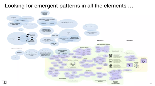
Slide 20—Clustering to visualize affinities
20. We often start with bubbles and blobs in a similar way, even if what we’re designing is digital. It gets all the elements on the table as objects we can move around, and show relationships between. They allow us to find emergent patterns and dynamics.
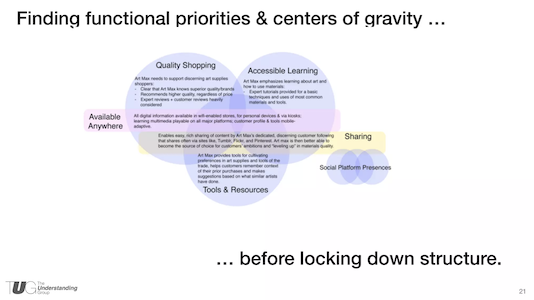
Slide 21—Stakeholder priorities emerging as the affinities coalesce
21. Often, the blobs coalesce—sort of like mercury merging into bigger globules—that help us identify the primary purposes of a new product, service, or environment. These become a way to represent the big priorities and decisions that stakeholders or even team members are aligned on. And it does this without debates about what should go in the global navigation or what color the menus should be.
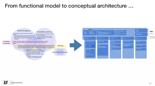
Slide 22—The site structure emerged from the functional model
22. More often than not, we find this sort of approach helps us discover the ultimate structure something can have—such as the navigation structure of a website or search application. The example on the right is a site structure diagram, but it’s more like a floor plan than a flow chart—it establishes places and their relationships, much like in building architecture.
Because a lot of the bigger questions have already been settled, the conceptual architecture isn’t a big surprise—in fact, it often just feels inevitable, rather than unsettled and up for debate. After this, we can better focus on the finer points of detailed structure and interaction design, without disruptive surprise
Modeling Is A Kind Of Making
23. To conclude, here are a few thoughts to leave behind: Modeling is a kind of making; rather than the craft of an object or interface, it’s the craft of understanding. It can work at many levels of fidelity—from abstract blobs to specific structures. Even if you aren’t included in the beginning strategy or architecture work of a project, modeling is still a powerful tool for helping figure out big or complex systems and find shared understanding.
24. Thanks!
Want to Learn More About Making Models?
If you’re interested in learning more, please see our current workshops!
Complete Slide Deck
Practical Conceptual Modeling at UX Detroit Feb 2015 from Andrew Hinton
A Beginner’s Guide To Taxonomy
Summary: With case studies and personal process anecdotes, Jessica DuVerneay explains how taxonomy is a valuable tool that should be in every IA's toolkit.
Last year, I was asked to act as Global Producer for the first ever World Information Architecture Day 2012. While it was a great challenge, it was one of the best things I’ve been able to do to support the global IA community. This year, I was honored to be asked to contribute to the local community through speaking at WIAD 2013 in Ann Arbor.
Nervous, as this was my first conference presentation, I was able to wrangle my friend and colleague Marti Gukeisen (from Enlighten) to tag team a presentation entitled “A Beginners Guide to Taxonomy”. Fresh off of our first “real” taxonomy projects, we were able to take a subject commonly perceived as dry and make it engaging and entertaining.
Using case studies and personal process anecdotes, the practitioner focused message was simple: Taxonomy is an incredibly valuable tool that can be approached in a simultaneously methodical and user centered way, and should be in every IA’s toolkit. In our talk we outline an quick and dirty approach to taxonomy, explain it’s benefits and challenges, and encourage practitioners to jump in and give it a try themselves.
If you missed the event in Ann Arbor, or want to chime in on the awesomeness of taxonomy, please check out this video of the Taxonomy talk and let us know what you think!
The Rise And Fall And Rise Again Of Information Architecture
Summary: TUG co-founder Bob Royce shares a pdf of the talk he gave at EuroIA titled, "The Rise and Fall and Rise Again of Information Architecture."
Last week I was honored to be able to present a talk at the Euro IA conference in Prague titled “The Rise and Fall and Rise Again of Information Architecture” which presents my perspectives on the field having witnessed it’s birth but only recently having engaged directly in it. The conference was wonderful, with good talks and even better conversations among the international attendees.
The Rise and Fall and Rise Again of Information Architecture (PDF)
2017 IA Summit Closing Keynote
Summary: To cap off IAS17, Dan considers the larger context of IA and our community and asks: is it dishonest to call ourselves information architects?
To cap off IAS17, Dan Klyn gives the closing plenary address. He questions whether — in our quest to make better online experiences — we’ve lost sight of what’s true. He also reflects on his research over the 8 years, seeing that progress in the field of information architecture requires a shift in emphasis.
Dan wonders: Is it dishonest to call ourselves information architects?
IAS17 Closing Plenary Address
Delivered on March 26, 2017 in Vancouver, BC, Canada. Dan is currently serving as the president of the IA Institute’s Board of Directors.
Allow me to begin with some thank-yous.
Thank you Susan Mercer, Dave Cooksey and Marianne Sweeney for the countless hours of hard work you put in so that the rest of us could enjoy this event together. I consider it an honor for you to have entrusted me with the task of closing it down for you.
Thank you to Peter Morville, for taking me on as a mentee 17 years ago, and for providing a model of what it looks like to be a professional information architect that I could learn from and follow. I got an email from him this morning wishing me luck with this speech, and he suggested that if all else fails, to consider taking my pants off.
Thanks and praise are also due to ASIS&T for its steadfast support of this community through eighteen IA Summits, and especially for having had the wisdom to select Vancouver as the host city for 2017. As a Michigander, I’ve been a visitor in Canada probably a hundred times, and this was the first out of 199 border crossings that caused me to feel ashamed of where I’m from.
So it’s good to have had some time away from all of that, and to have been welcomed so warmly in this breathtakingly beautiful place.”
Read the rest on Medium:
medium.com/@danklyn/2017-information-architecture-summit-closing-plenary-address-efb0e0e21d2c


